
Written by Aravind Suresh, Data Scientist at MyGate
1. Introduction
The difference between a successful data-driven project and a subpar one is the way it is visualized and presented. Often projects lose their credibility because of the complexity in its presentation.
The archetypal presence of visualisation in any data centric project is akin to presentations in the business world. Co-incidentally the two domains are now being tightly woven with demands of data-driven insights becoming commonplace. One such request fell onto my table which required effective usage of tools to build a moving illustration to substantiate and validate a customer service use case.
This post showcases my approach to solve the problem of constructing an interactive infographic to depict the trending volume of tweets for a given topic across 24 hours in selected cities.
Disclaimer: Data sets utilised here are generated only for simulation and may not reflect actual values.
2. The data processing
The first step for any data science project is to identify your data source and process information. You begin by gaining access to the target system which can either be a public API or over a protected landscape. There may be other considerations that include movement of data from one zone to another for consumption, but that’s a topic for data engineering.
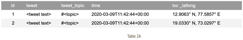
The nature of data that is under consideration here can be categorised as audit or log-based information that taps into twitter activity of members. We initiate an extract, transform, load (ETL) pipeline to allow flow of data to my workspace. The expected structure of final data set would look like;
Now apply a series of data cleansing techniques such as alteration, aggregation, group by (over bucket of time) to arrive at a consumable format of information. For me, the final data set appears as;
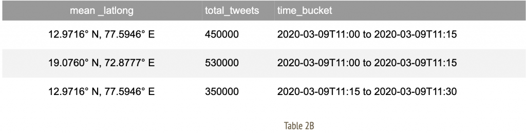
These rows indicate time slices for given city identifiers with an aggregate total number of tweets observed in that duration.A note on geographical data: Often, location specific information may arrive with geo coordinates with varying degrees of accuracy. In such an event, we attempt to establish a mean around the coordinates of selected cities. This allows us to amalgamate records specific to a given geographic location to the nearest city as observed in Table 2B.
3. Methodology to visualise
After arriving at a consumable data structure, we must construct a strategy to visualise information. At this stage, each individual time slice carries all relevant data to indicate city of origin and total tweets accumulated.
We filter upon this table by time buckets for each frame defined as;
- A maximum of 5 frames per second
- Each frame is indicative of 1 time bucket
- Each time bucket spans across a 15 minute window
Evidently, all of the frame definition rules are configurable to suit your illustration needs. We further apply the following routine for each individual frame.
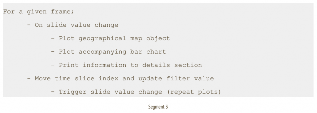
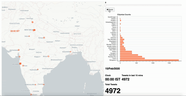
In this context, I go with a simple layout of a geographical map of the target country, alongside a horizontal bar chart of selected cities, a details section to indicate total tweets, a slider control at the top to indicate time window and an action button with play/ pause options to traverse through the slider.
3.1 The libraries
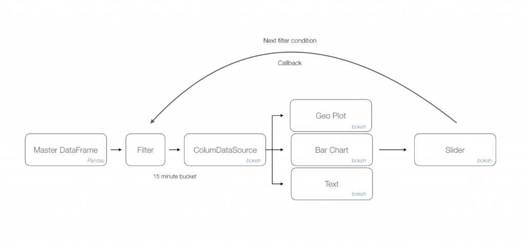
As you may have gathered, there are extensive data processing needs and the much revered Pandas [1] library comes to our rescue. The easy to use data analysis, manipulation toolkit is as powerful and flexible as advertised. The outcome of this process is a master data frame which is consumed by a downstream program.
We append a filter method listener that acts upon the data frame to load desired information onto a column data source of Bokeh [2] library. This data object manages all bindings with target renderers. Once we have isolated the visualisation controls, in this case a combination of geo plot, bar chart and text; Bokeh allows us to just update the bound column data source to achieve moving illustrations.
Finally, a slider control acts as a handler to accept time window inputs and issue necessary callbacks to the filter method thus triggering changes in all visualisation controls.
The following workflow diagram depicts approach diagrammatically
Bokeh library is a natural addition to your visualisation portfolio that would include Matplotlib [3]. The final output is exported as a html page that can be rendered through any browser. You can further use a screen recorder to convert this into a distributable format such as .mov or .gif file.
4. Other scenarios
The narrated approach can be applied to visualise a variety of data use cases that has multiple dimensions of time series, geographical coordinates and activity count. Some suggested scenarios across domains are as follows;
The narrated approach can be applied to visualise a variety of data use cases that has multiple dimensions of time series, geographical coordinates and activity count. Some suggested scenarios across domains are as follows;
- Manufacturing throughput at plants in selected cities across 24 hours.
- Online payments activity for a given year in selected cities.
- Patient treatment trends each decade for a category of ailment throughout the country.
- Track global reported cases of pandemic influenza since initial occurrence [4]
References
1. Pandas – open source data analysis and manipulation tool https://pandas.pydata.org/
2. Bokeh – Interactive visualisation library
https://bokeh.org/
3. Matplotlib: Visualization with Python
https://matplotlib.org/
4. Track Reported Cases of COVID-19
https://coronavirus.jhu.edu/map.html